
A New
Kind of Healthcare
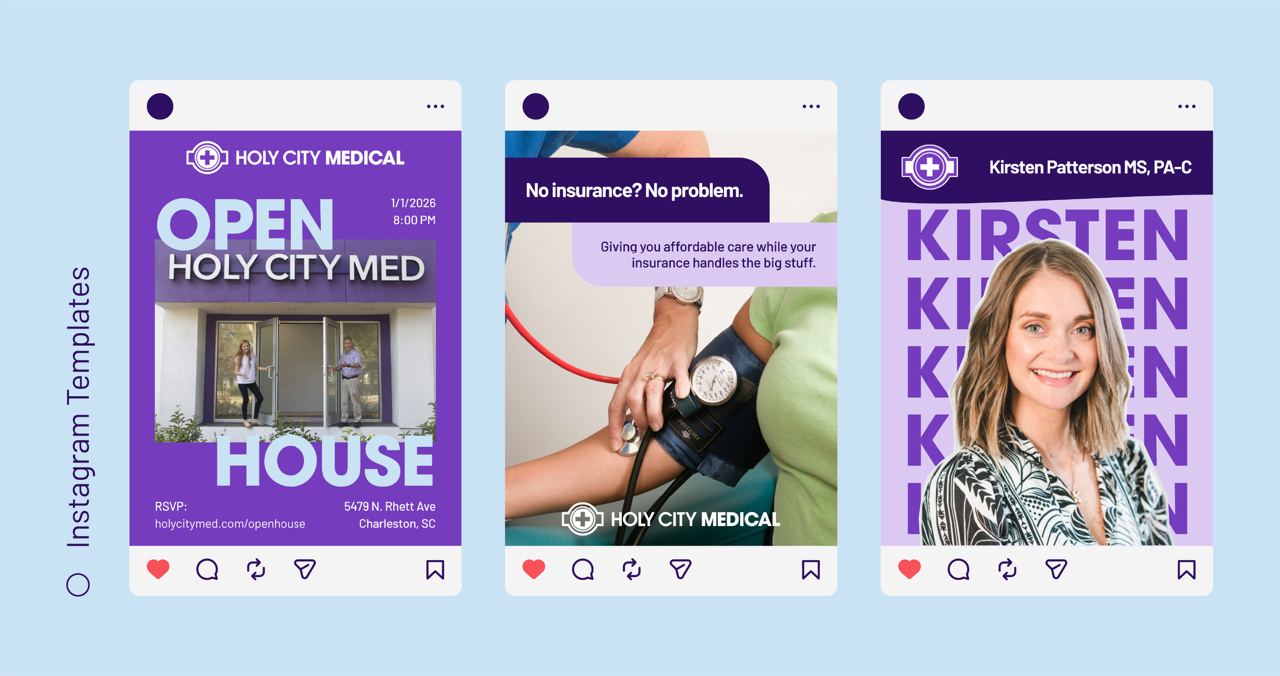
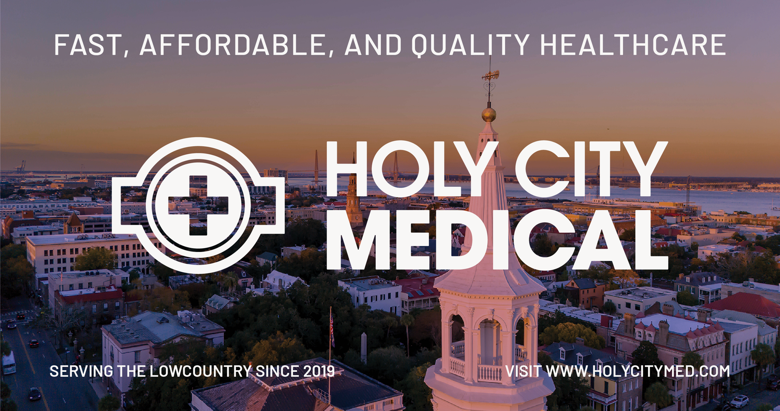
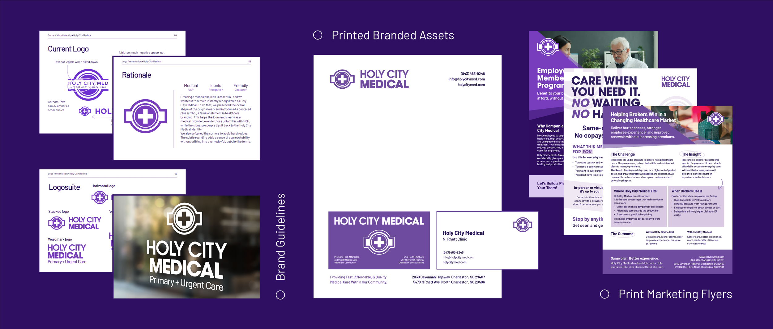
Holy City Med is a new kind of healthcare clinic built around hospitality, affordability, and efficiency. Unlike traditional clinics that can feel impersonal or overwhelming, Holy City Med set out to create a patient-first experience that is welcoming and approachable. The project included developing a brand identity that reflects these values while ensuring the clinic stands out in Charleston’s healthcare landscape.
Breaking the Mold
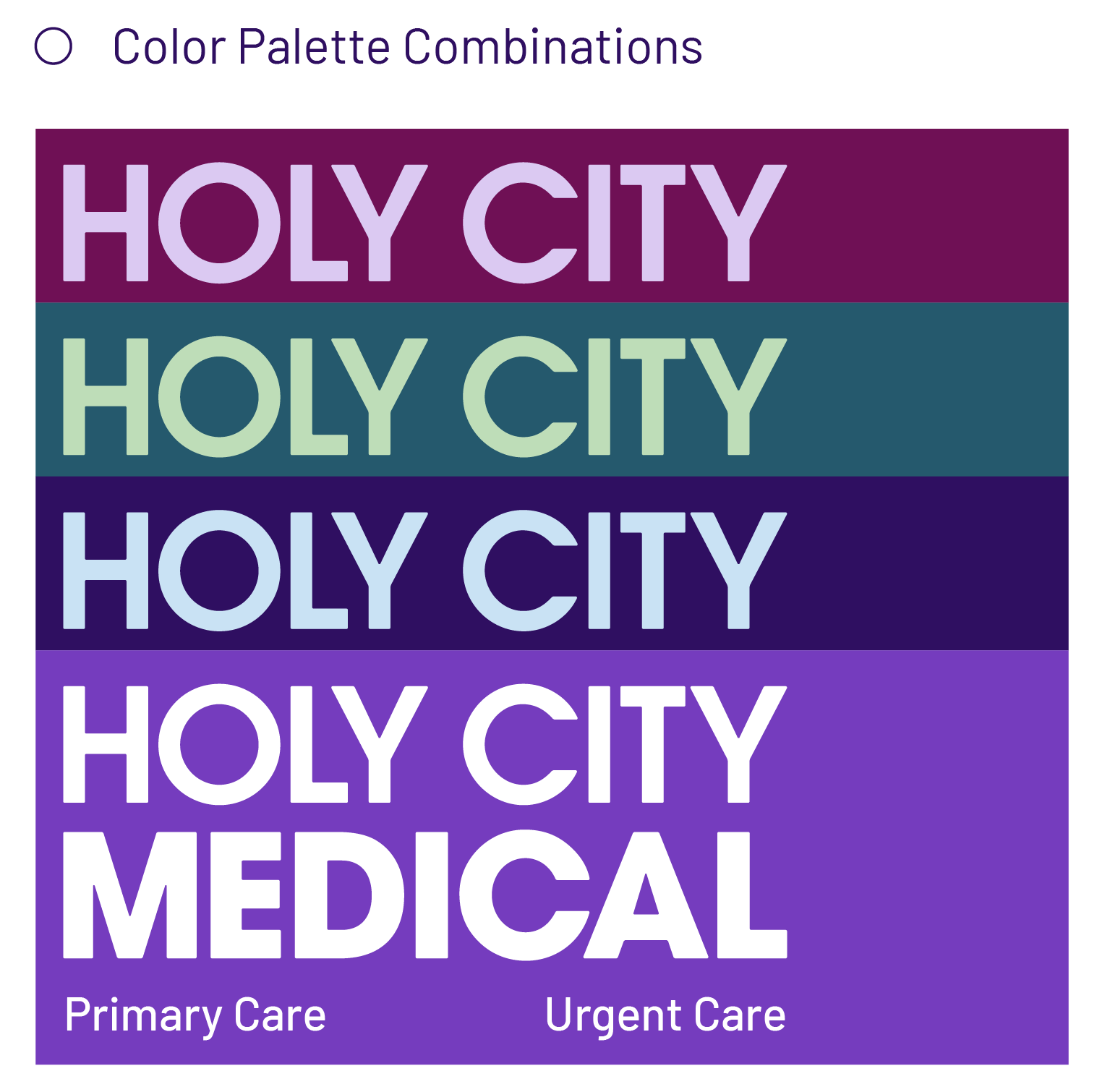
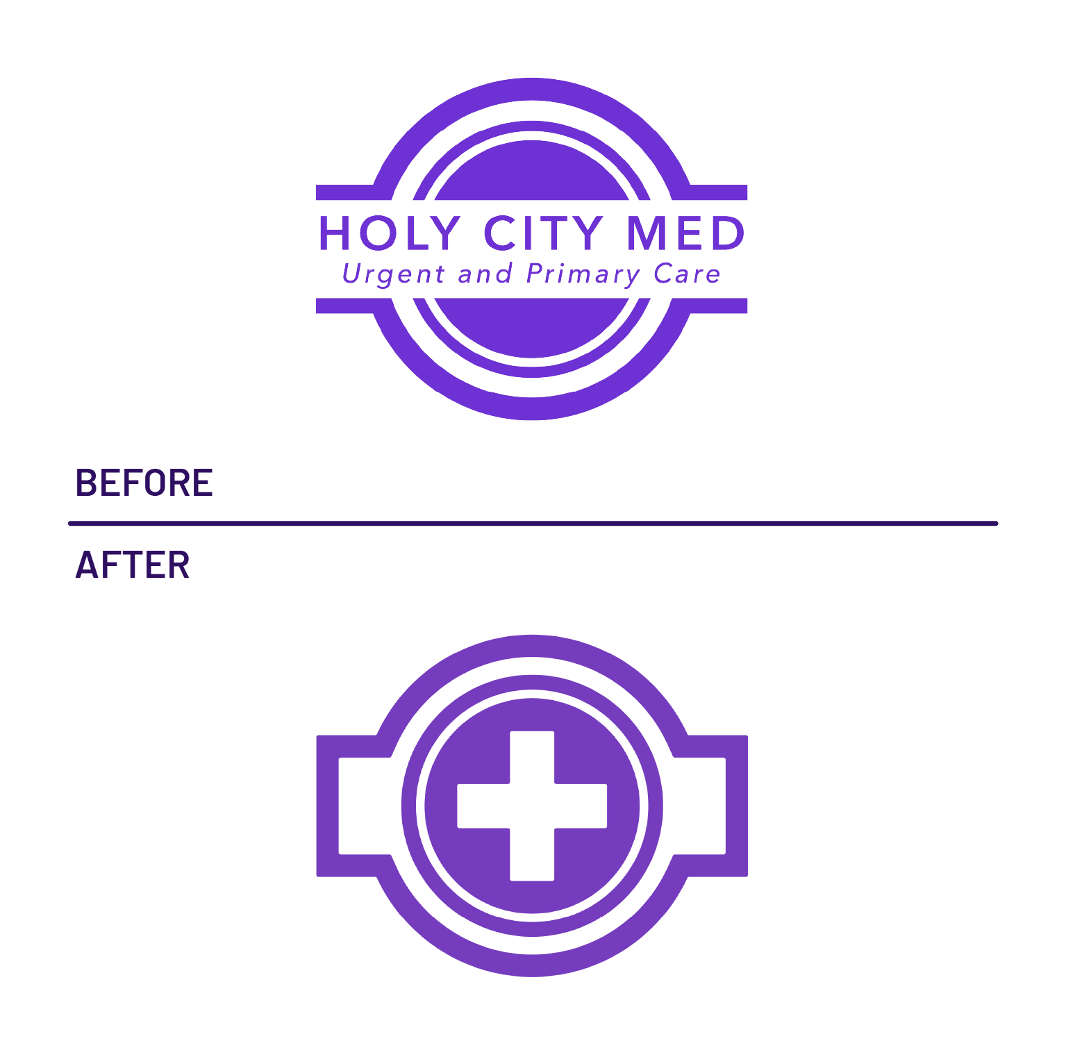
The challenge was to design an identity that felt warm and inviting while still communicating professionalism and trust. Most healthcare brands lean heavily on traditional blues and reds, but Holy City Med wanted to break away from that mold and carve out a distinctive visual presence. Purple was chosen as the primary brand color to symbolize creativity, warmth, and a strong association with the founders Faith. To further emphasize the focus on hospitality, the brand needed a mascot that could represent friendliness without sacrificing credibility. This led to the concept of Penelope the Purple Pineapple, a symbol that ties directly to the city’s history of hospitality while creating a memorable and approachable face for the clinic.

The Solution
The resulting identity positions Holy City Med as a refreshing alternative to conventional healthcare branding. A bold purple palette makes the clinic instantly recognizable and reinforces its goal of becoming synonymous with the color in Charleston. Penelope the Purple Pineapple serves as the brand’s mascot, embodying warmth, welcome, and a sense of community. Supporting typography balances modern clarity with a touch of softness to ensure the brand feels both professional and approachable. The combination of color, mascot, and clean design elements creates a cohesive system that communicates trust and efficiency while breaking away from the sterile conventions of healthcare branding. Holy City Med emerges as a clinic that patients not only recognize but also feel comfortable visiting.
Dare to be Different
With Holy City Med, I had the chance to challenge conventions and reimagine what healthcare branding could feel like. Creating Penelope the Purple Pineapple was especially rewarding, as it gave the clinic a unique personality rooted in Charleston’s culture of hospitality. The result is a brand that patients instantly connect with, built on both trust and personality.